
In undergrad I wrote a thesis estimating the effect of Sound Transit’s Link light rail on King County property values. I used synthetic control, got a positive but noisy result, and moved on. A few weeks ago Joe Russel, a colleague at the City Budget Office, sent around a paper on transit capitalization that put the thesis back in my head. I’m also taking an applied econometrics course, which is how I learned that staggered difference-in-differences has come a long way since I last touched this question. So I decided to redo it.
This post is about what changed when I swapped in better tools, and what one station — Capitol Hill — actually shows once you look at the data the right way. There are findings here I’d defend on a Friday at 4:30pm. There’s also one finding I started out wanting to make and had to walk away from, which is its own kind of result.
The setup
The original thesis took every Link station and tried to estimate a single average effect. That averaging hides a lot. A station opening in a dense urban neighborhood with no prior rail access does something very different from one opening in an area already well-served by buses. So this time I ran the analysis station by station.
For each station I defined three groups of residential parcels:
- Treated: within 0.5 km of the station (the walkshed)
- Control: a 1.0–1.5 km doughnut around the same station — close enough to share the local housing submarket, but outside the walkshed
- Excluded: parcels in the 0.5–1.0 km buffer between treatment and control, anything beyond 1.5 km, and any parcel within 1 km of a station from a different opening cohort
I started with a wider 1.5–3.0 km doughnut. When I plotted the raw data on a map, I could see a southwest-to-northeast gradient running across that wider ring — older urban housing on one side, newer suburban housing on the other. That gradient isn’t a station effect; it’s just Seattle. The tight 1.0–1.5 km control is much more spatially homogeneous, which is what you want. Tightening it shrunk the headline numbers by 2–3 percentage points and produced visibly cleaner pre-trends. I report the wider ring as a robustness check.
The estimator is Callaway & Sant’Anna (2021) with never-treated controls, doubly-robust estimation, and parcel-clustered bootstrap inference. The data is residential parcels from King County Assessor vintage extracts — about 170,000 single-family parcels in Seattle, with raw KCA assessed value as the outcome (logged), running from TY2010 to TY2026.
I focused on two cohorts where the design is cleanest: U-Link, opened March 2016 (Capitol Hill, University of Washington), and the Northgate extension, opened October 2021 (U-District, Roosevelt, Northgate).
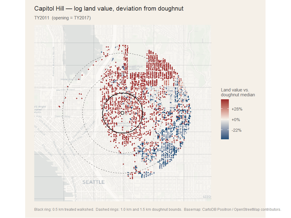
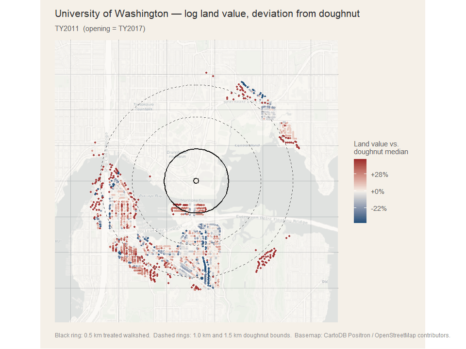
How to read the maps
Each per-station figure below is six small panels, one per tax year. The years are spaced to show the run-up to opening, the opening year itself, and the post-treatment trajectory. Each dot is a single parcel.
The color is not raw appreciation. It’s that parcel’s log-land-value change since the start of the window, minus the median change in the station’s doughnut control band that same year. Red means the parcel appreciated faster than the local control group; blue means slower; pale means it kept pace. Subtracting the doughnut median strips out the city-wide housing trend, so what’s left is the differential — which is what the regression estimator is identifying.
The solid black ring is the 0.5 km treated walkshed. The dashed rings mark the 1.0 km and 1.5 km bounds of the doughnut control band. Parcels in the gap between the solid ring and the inner dashed ring are excluded from estimation and shown only for visual context.
Capitol Hill: the result I’d defend
Capitol Hill is the cleanest finding I have. Pre-treatment ATTs from 2011 through 2016 sit in a narrow band near zero. At the year of opening (TY2017) the series jumps above zero and stays there. The post-treatment trajectory peaks at roughly +24% around event time +4 (which is TY2021, the local Seattle housing peak), then attenuates as the 2022 macro reset hits.
The simple aggregation — average post-treatment ATT — is +11.8% (95% CI: +8.0%, +15.6%) for the 0.5 km ring and +8.2% (+6.1%, +10.3%) for the 1.0 km robustness ring. Both significant. Both squarely inside the range published in the transit capitalization literature.
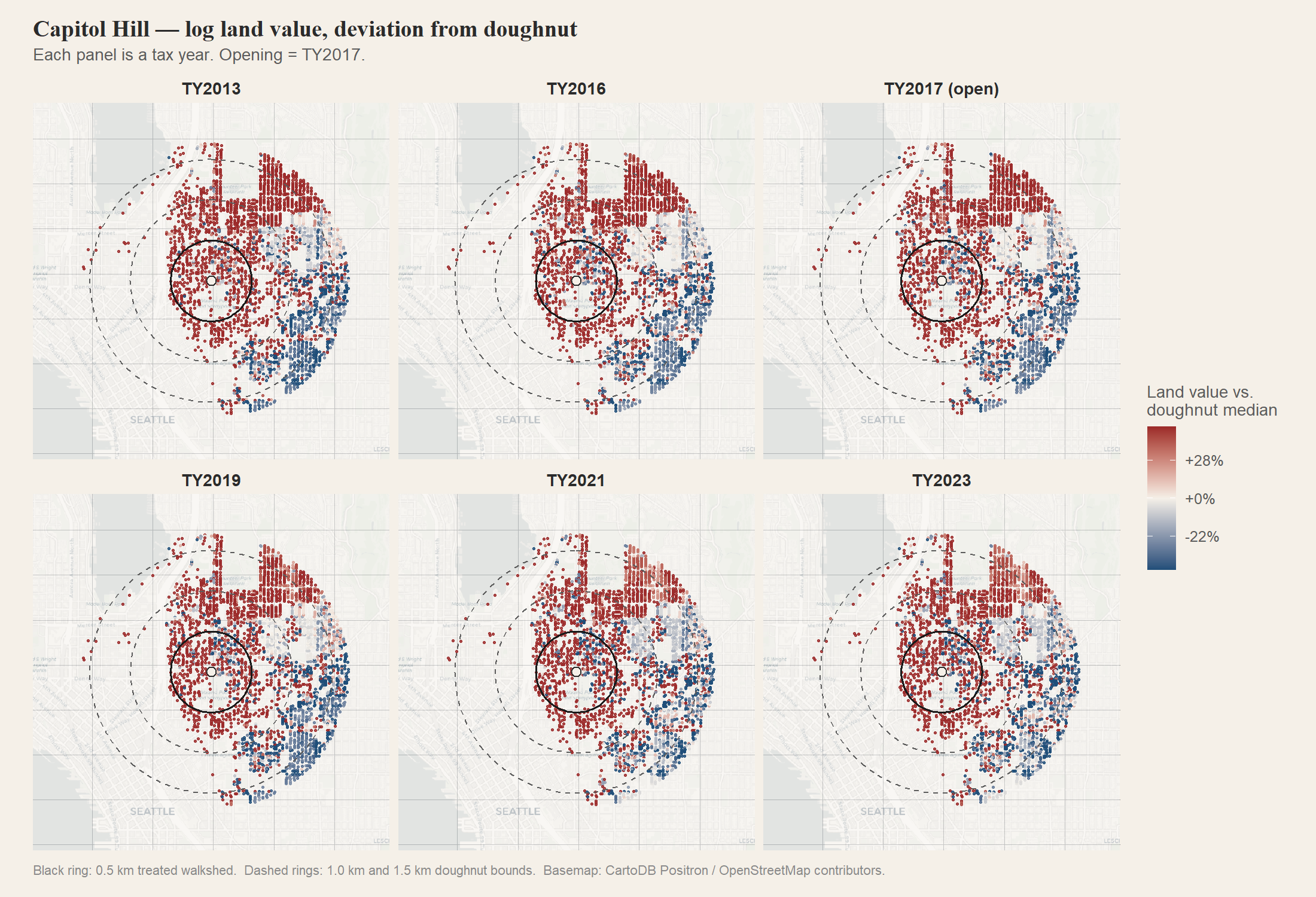
The TY2013 and TY2016 panels are the pre-period. There’s a clear standing gradient — Broadway and the Pike-Pine corridor on the east side of the treated ring already trade at a premium to the doughnut, even before the station opens. That’s not a treatment effect; it’s the underlying geography of where Seattle’s older urban housing stock sits. What the regression identifies is the change in that gradient after 2017.
The TY2017–2023 sequence shows red filling in inside the 0.5 km ring as the post-treatment years progress, while the doughnut stays roughly white. By TY2023 the differential has spread well across the treated walkshed. (See the year-by-year animation.)
The falsification test
Here’s what convinced me the result is real and not just neighborhood appreciation getting picked up by a sloppy comparison. Amenity capitalization theory has a clear prediction: the value of new transit access should concentrate in land, not in improvements. The station makes the dirt more valuable. It doesn’t make existing buildings better.
Re-running the same model with land value and improvement value separately gives me:
| Outcome | ATT |
|---|---|
| Land value | +30.0% |
| Improvement value | −69.3% |
| Total assessed value | +11.8% |
The land coefficient is roughly three times the size of the total. That is exactly what amenity capitalization predicts. The negative improvement coefficient looks alarming but is a known artifact: transit-oriented parcels near Capitol Hill Station got torn down and rebuilt, and a parcel that had a small house in 2016 and is mid-construction or recently rebuilt by 2024 shows a much lower assessed improvement value during the redevelopment window. Same parcel ID, dramatically different building.
A skeptic could argue that something about Capitol Hill caused both land appreciation and improvement disinvestment, and that something happened to coincide with March 2016. Possible. But the direction and magnitude of the land effect, the timing relative to the opening, and what the decomposition shows at other stations all point at the station.
UW: a counterexample that I find clarifying
The UW spec at 0.5 km has a tiny treated sample (n=61) because most parcels
inside that ring are campus, hospital, or student housing — none of which
are prop_type == "R". The total ATT lands at +5.2% (+1.3%, +9.1%), which
is barely significant.
The decomposition tells a different story than Capitol Hill, though:
| Outcome | ATT |
|---|---|
| Land value | −8.8% |
| Improvement value | +29.7% |
| Total assessed value | +5.2% |
The figure makes the small-N issue visible immediately. Most of the area inside the rings is empty — campus, the hospital footprint, Lake Washington and Portage Bay to the south. The handful of residential parcels that do sit inside the treated walkshed don’t show a coherent post-2017 shift. Land down, improvements up — the opposite of amenity capitalization. (Animation here.)
The most plausible explanation is the UW building boom that ran through the late 2010s — new dorms, hospital expansion, lab buildings — all of which raise improvement values without changing the underlying station amenity. The 2016 light rail opening just happens to fall in the same window. I wouldn’t call this a station effect. I’d call it a UW campus effect that happens to look like one if you only stare at total assessed value.
This is exactly why the falsification test is worth running separately for each station. The total ATT alone would have let me tell a clean “diminishing returns” story (Capitol Hill big effect, UW small effect, both consistent with the literature). The land-vs-improvements split says that story is wrong — only Capitol Hill is showing actual capitalization.
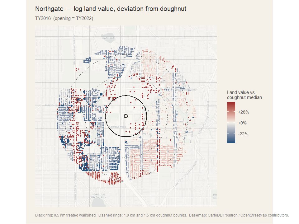
The Northgate cohort: too soon, or too messy
The Northgate extension opened in October 2021. That gives me at most three post-treatment KCA vintages (TY2022, 2023, 2024) plus the 2025 and 2026 forecast vintages. The post-period is short, and most of it falls inside the 2022 mortgage-rate shock.
The headline numbers, same tight-control design:
| Station | Total ATT | Land | Improvements |
|---|---|---|---|
| U-District | −9.3% | −33% | +94% |
| Roosevelt | −6.0% | −9% | −7% |
| Northgate | +0.8% | −4% | ~0 |
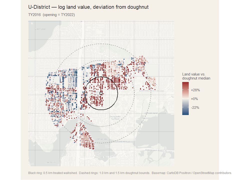
U-District: measuring the assessor, not the market
I do not believe U-District is showing a 33% land-value decline. The U-District is the most aggressive transit-oriented redevelopment area in Seattle right now — old single-family lots and small apartment buildings are being torn down and replaced with mid-rise. When the assessor processes that turnover, the assessed land/improvement split on the parcel ID sometimes resets in ways that don’t reflect a market transaction. The total assessed value at the parcel ID may also rise dramatically because a duplex turned into a 60-unit building. I’m measuring assessor mechanics, not capitalization.
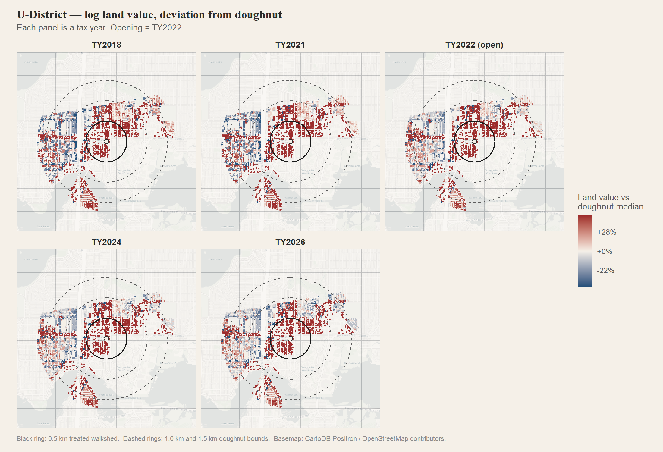
The figure makes the issue visible — you can see individual parcels flipping abruptly between frames as the assessor reclassifies them, in a way that doesn’t happen at Capitol Hill or UW. That’s not a market process. That’s bookkeeping. (Animation here.)
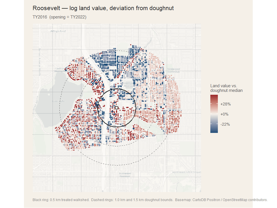
Roosevelt and Northgate proper
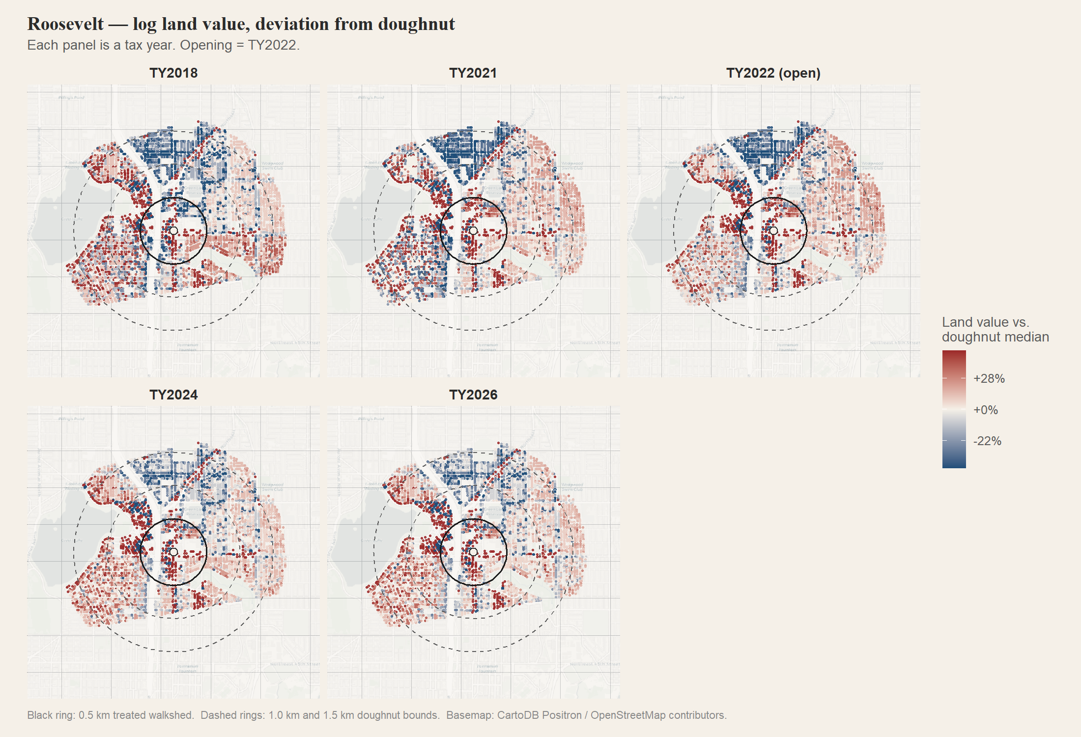
Roosevelt is closer to a real result, but with both land and improvements moving down together it’s hard to separate a station effect from the macro shock that hit transit-oriented neighborhoods harder than the rest of the city in 2022. (Animation here.)
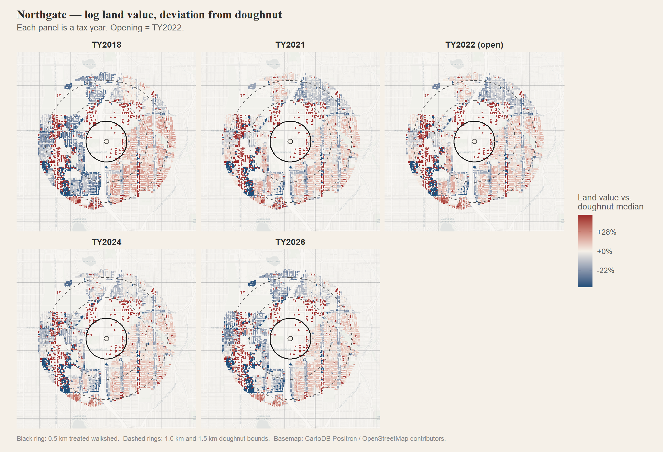
Northgate proper is null, with wide error bars and only 55 treated parcels. The small sample reflects the underlying geography: the mall, the transit center, Sound Transit’s own redevelopment site, and I-5 immediately to the west together swallow most of what would otherwise be the residential walkshed. (Animation here.)
The honest answer for this cohort is “ask me again in 2030, with five more years of data and ideally with sales records.”
What this changes about the thesis
The county-level pooled estimate I produced in undergrad was a noisy positive. The new station-level estimates suggest that pooling was hiding two real things: capitalization happens where light rail provides genuinely new accessibility (Capitol Hill); and the parcel-level AV panel I’m working with has structural blind spots in heavily redeveloping neighborhoods (U-District). Both are sharper, more useful claims than what I had before.
I also now believe the original synthetic control was working harder than I realized. The new design doesn’t ask any one match to do too much — it just asks whether parcels near the station moved differently from parcels in the same submarket farther out. With a long pre-period and a tight comparison ring, that’s a much easier question to answer.
Caveats
The Wald test for parallel trends formally rejects in every spec. With thousands of treated parcels the test will reject anything short of a literal flat line. The pre-period oscillations on Capitol Hill are small — a few percentage points — relative to the post-treatment effect. A reader who weights formal tests heavily should treat the magnitudes as suggestive rather than precise.
KCA assessed values are a noisy proxy for market values and update on a lag. The land/improvement split is reset by the assessor when buildings turn over, which is exactly what generates the U-District artifact.
The control-doughnut design assumes spillovers from the treated ring don’t extend past 1.0 km. If they do, my estimates are biased toward zero.
What’s next
I want to redo this with sales data instead of assessed values. That fixes the U-District redevelopment problem because each observation is a real transaction at a real price, with no parcel-level structural breaks. It also lets me look at displacement effects — whether long-time owners cash out or stay — which is the version of this question that actually matters for policy.
If you read this and have thoughts, push back. The whole point of moving the thesis from a PDF in a drawer to a public post is that I’d rather be told I’m wrong now than later.
Station coordinates from Sound Transit. Parcel locations from KCGIS. Basemap tiles from CartoDB Positron, underlying map data from OpenStreetMap contributors.
Start the conversation